
Sperry
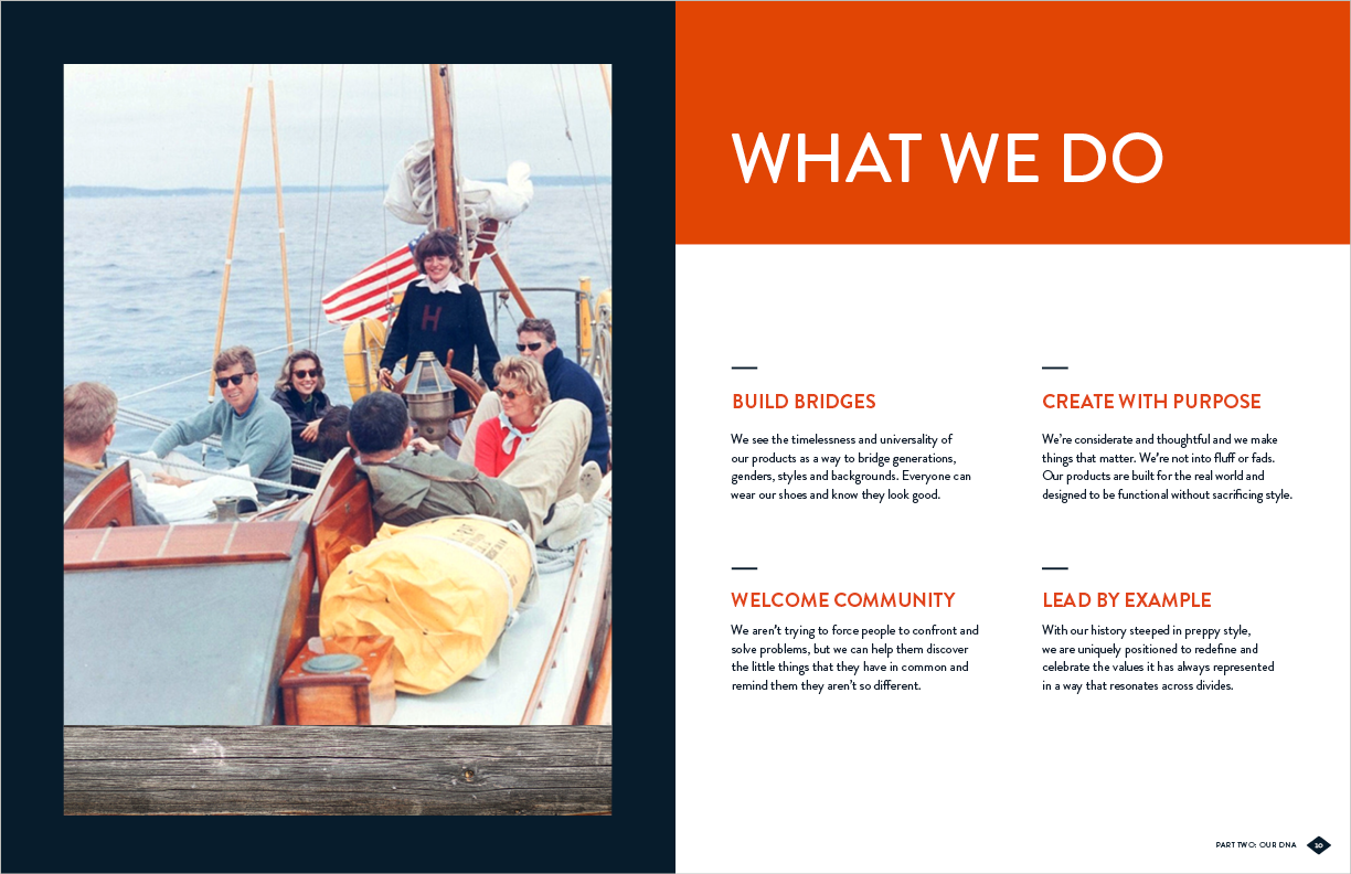
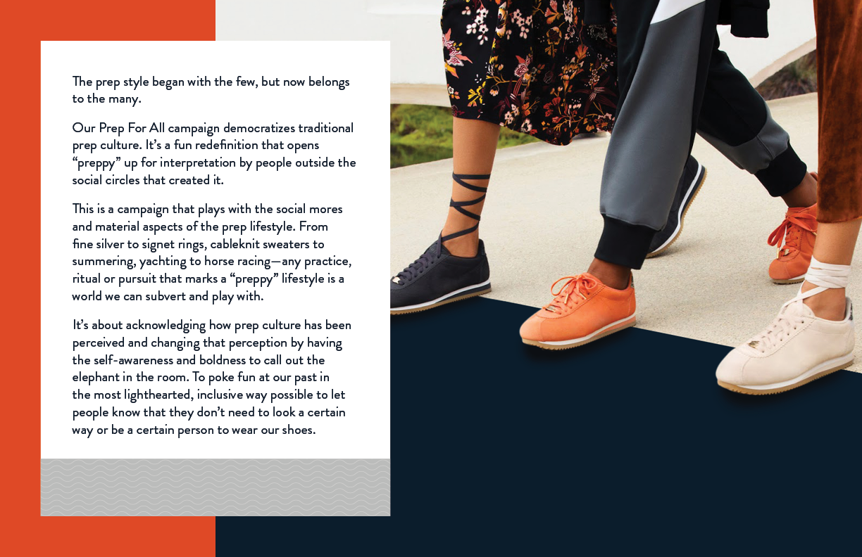
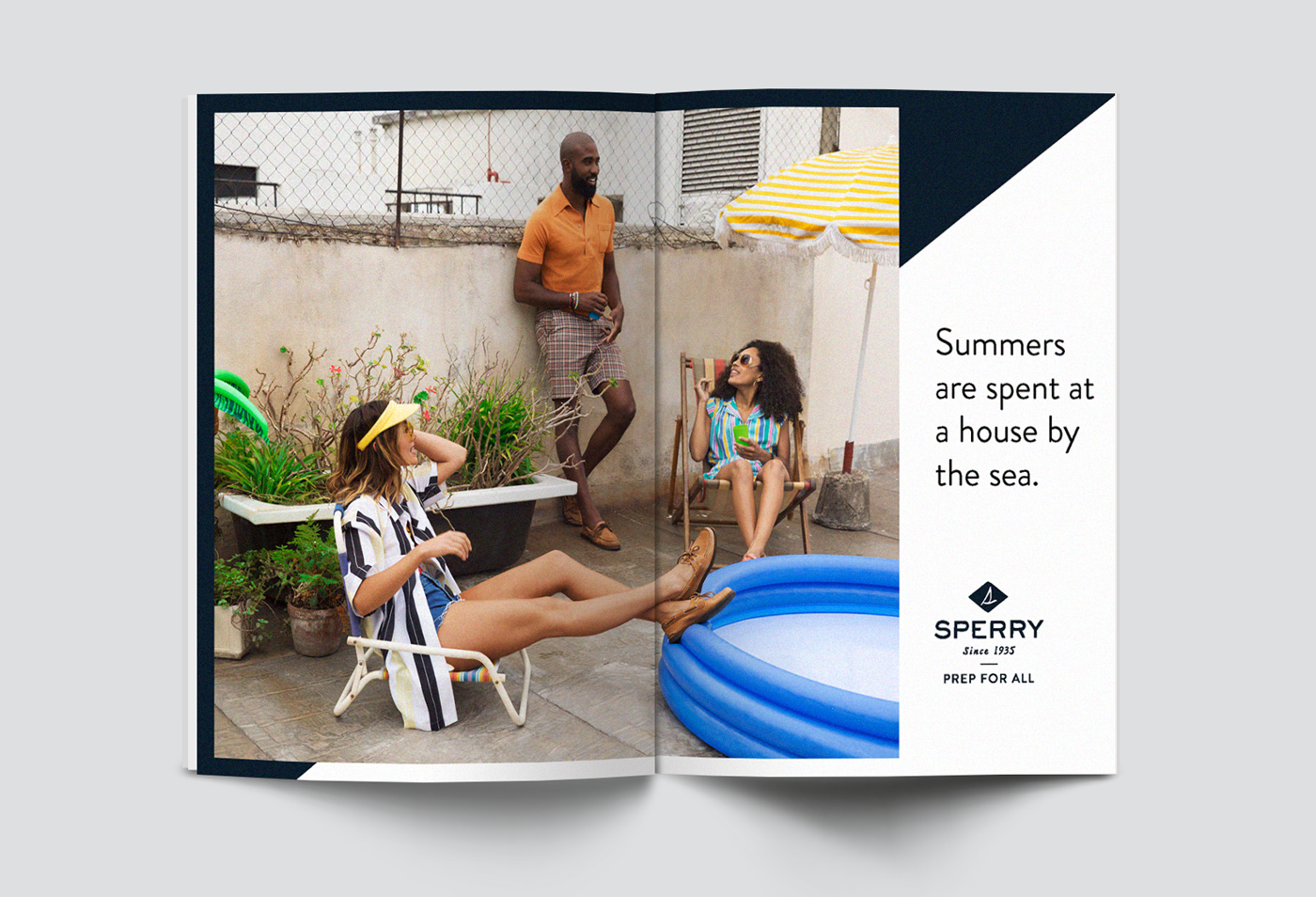
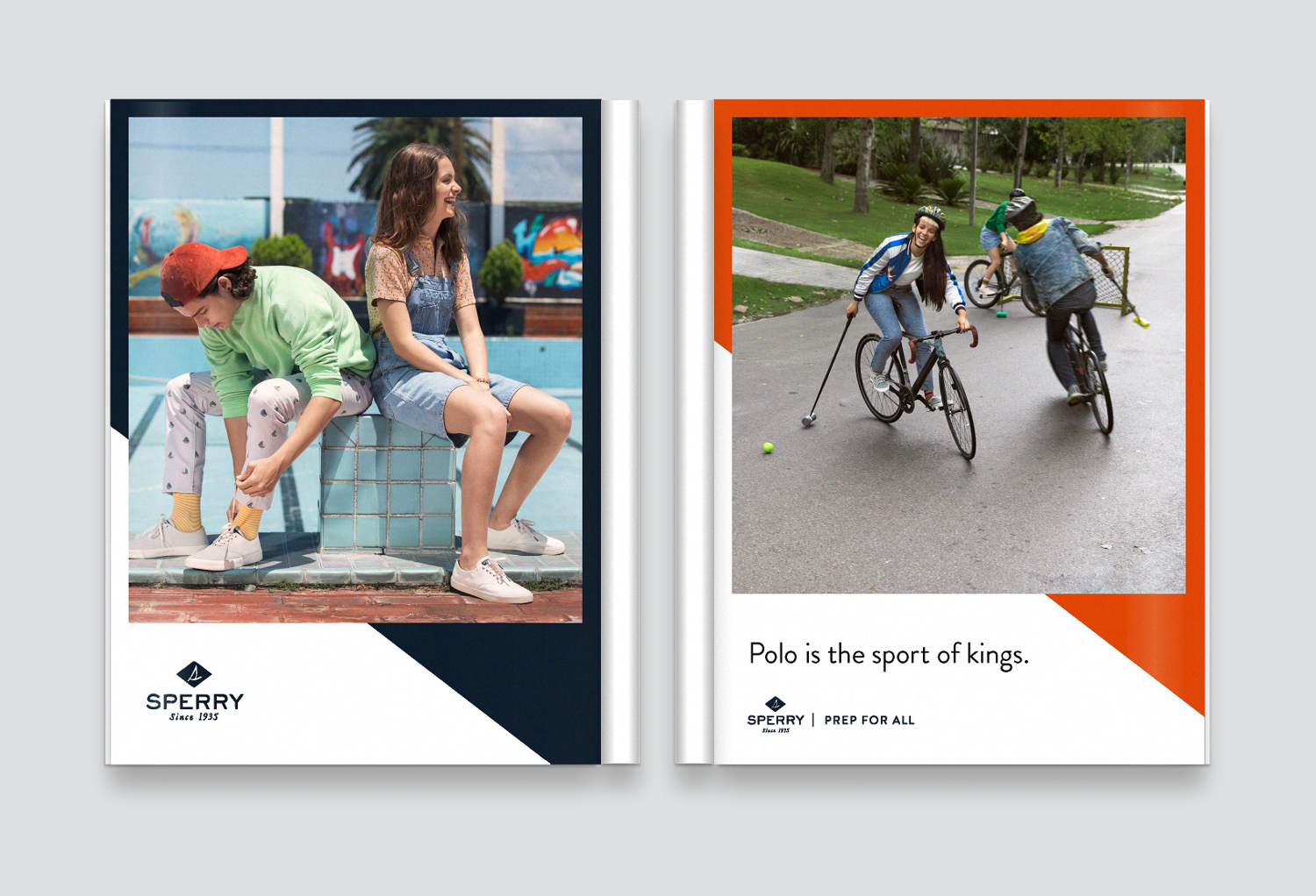
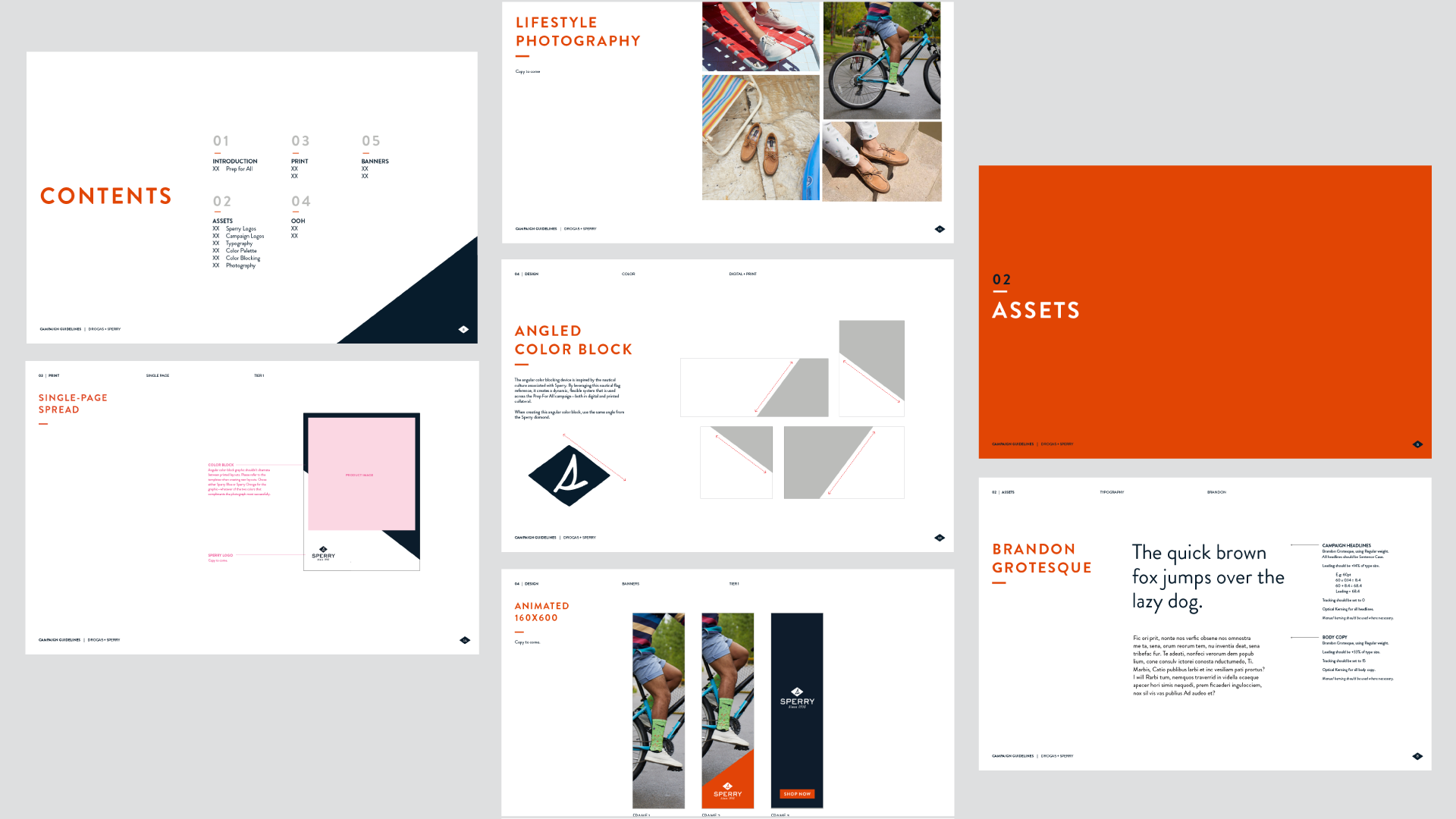
Sperry came to us to help redefine their point of view, and develop a more grounded brand purpose. From that, a new visual system was born. A company strongly rooted in heritage and its ties to water, we wanted to celebrate the quality and consideration that has spanned generations. We reimagined their current use of ocean-centric photography by utilizing a more understated and symbolic approach to their brand booklet. We played with nautical textures expressed through minimal photographic texture or a graphic interpretation. This system evolved to define the look and feel of the Prep for All Campaign.
Design: Maria Wan, Kelsey Lynch and Jaymes Barone | Creative Direction: Rachel Frederick, Dana Stalker
Brand Book
When looking through nautical references, flags immediately came to mind. These strong graphic compositions became the basis for our editorial layouts, and eventually contributed to graphic elements within our campaign system.



Layout Explore

Print & OOH



Guidelines
Creative Direction Credit: Belen Marquez, Abe Chuang